

What Is GIS?
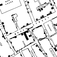
London 1854. Dr. John Snow observes that victims of a cholera epidemic live in the same area. Plotting their homes on a map he discovers that nearly all get household water from the same pump.1 Tests reveal contamination, the pump is closed and the epidemic ends. That map may have been the first practical geographic information system (GIS).
GIS is often confused with GPS. Both start with “G,” end with “S” and deal with geography, but GPS tells us where we are while GIS helps us visualize and analyze information geographically.
How Is GIS Helpful? One picture is worth a thousand words. An investor could look at stock price tables to find trends, but most prefer the visual clarity of charts.
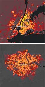
Likewise everyone knows that both London and New York are big cities, but the graphics at the left show that New Yorkers tend to be clustered in several central districts (yellow), while Londoners are more evenly dispersed (orange and red, lower density).3
How Does It Work? Essentially a GIS connects data to location, enabling the relationships to be shown visually and used in calculations. For example to create the population density maps you would tabulate population by census tract (location). Then to show the results on a map you connect the census tracts to geographic coordinates such as latitude and longitude that can be plotted.
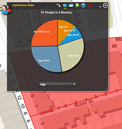
How Is GIS Used? GIS can be used to analyze data for marketing studies,4 public health analyses5 and energy exploration.6 It can also be used to make complex data readily available to the public. For example, the City of Boston on-line Census Viewer enables you to examine 2010 census data by outlining an area as small as a single block. The sample at the right shows age statistics for a block on Beacon Hill.
In academia, an historian plotted the expansion of slavery and cotton planting from 1790 and 1860. Placed side by side and animated the maps clearly show that both expanded into the same places at the same times.6 Researchers of the Roman Empire and medieval times can visualize their worlds with Harvard’s Digital Atlas of Roman and Medieval Civilizations.
What Do I Need? To begin with you need the data you want to analyze, sales for example, and the related locations, such as clients’ addresses. Usually locations such as street addresses need to be converted to geographic coordinates, such as latitude and longitude. There are numerous tools and services for doing this; some are free.8
Then you will need software to analyze and map the results. The most widely used professional product is ArcGIS. For those with less sophisticated needs, there are tools for creating maps from within Excel, including an Excel add-in that works with ArcGIS Online.9 Harvard also has an open source platform, WorldMap, that you can use for free.
For detailed information about implementing GIS, visit the detailed on-line GIS Tutorial by the Harvard Graduate School of Design.
-----
- The story of the epidemic and Snow’s efforts to solve it are told in Johnson, Steven (2006). The Ghost Map. Riverhead Books.
- Detail from map by John Snow showing victims surrounding contaminated pump. Wikipedia.
- Population density maps from the Urban Observatory.
- See, The Relationship Between GIS and Marketing, University of Southern California.
- See, Public Health GIS Resources, Sheldon Margen Public Health Library, U.C. Berkeley.
- See, Geographic Information Systems for Oil and Gas, Getches-Wilkinson Center for Natural Resources, Energy, and the Environment, University of Colorado Law School.
- Map from Mapping History web site, University of Oregon. Another uses a series of maps to compare shifts in free and enslaved populations during the same period. Lincoln Mullen, These Maps Reveal How Slavery Expanded Across the United States, Smithsonian.com, May 15, 2014.
- Texas A&M Geoservices has a free service, as does the U.S. Census Bureau.
- See, Caitlin Dempsey Morais, Making Maps With Excel, GIS Lounge, August 15, 2012.
This article originally appeared in our free semi-monthly newsletter. To receive future issues, please add your name to the subscription list.